Description
Project Overview
Problem to solve: A gap in the market
After volunteering around the world in projects with a length of around two weeks each, I realised there was no place to look and find shorter-term projects if I wanted to participate in some events within the community but I didn’t have much time.
Time frame:
October-November 2020, during the UX/UI Intensive Bootcamp at AllWomen.
Role:
SOLO DESIGNER: Responsible for all phases of the project including
User research – Ideation – Prototyping – Testing – Iterating
Project Phases:
The project followed the stages in the Design Thinking process.

First Hypothesis
We believe that creating a space where you can easily find short term experiences to help within the community to make the world a better place for people who are travelling who wants to volunteer but don’t have much time, will achieve having a very special experience where they can help, feel fulfilled, be in contact with the community and feel they are giving back to them.
1. Empathize: User Research
What did I want to find out?
- Where people usually volunteer.
- What motivates people to volunteer.
- For how long people prefer to volunteer.
- How difficult is to find projects to volunteer.
- What are the difficulties organisations face to find volunteers and when they work with them?
- For how long organisations prefer people to help in their projects.
Research Methods
Quantitative Research: 259 surveys
1st round (before interviews):
69 Surveys to volunteers around the world
49 Surveys to organisations around the world
2nd round (after interviews):
98 Surveys to volunteers around the world
25 Surveys to organisations around the world
18 Surveys to Spanish organisations
Qualitative Research: 6 interviews
2 Organisations in non-developed countries: Vietnam and Tanzania
1 Organisation in a developed country: Red Cross Spain
3 People who volunteered in their hometown and while travelling. They were from Portugal, Argentina and Spain.
Travellers don’t think to volunteer for a day as they don’t know this could be an option. If this was offered I’m sure they would be willing to participate in these projects
Mariana, Buenos Aires
Research Analysis
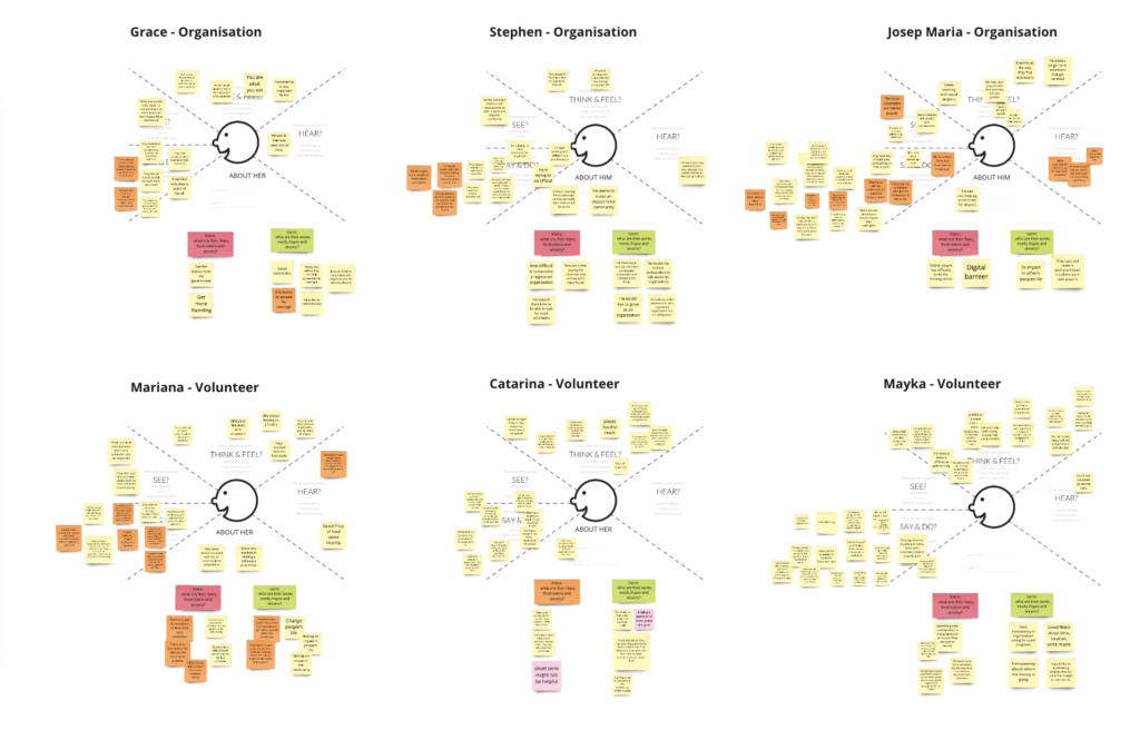
Empathy Maps from the interviews

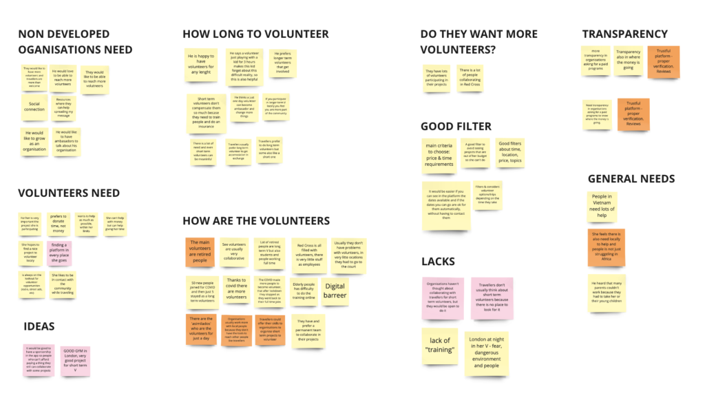
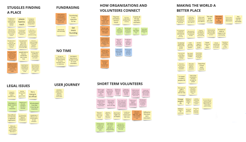
Affinity Maps


Converting Assumptions to Insights


Final Insights
- People volunteer more locally than when they travel
- There is no platform to look for short term volunteers to discover and get inspired
- Organisations don’t have time to talk to volunteers
- Volunteers sometimes don’t show up and are not trustful people
- People want to be able to find all the info online so they don’t have to contact organisations to apply
- Necessities for organisations in developed countries are very different than for organisations in non-developed countries
2. Define:
Redefining the Problem
We believe that creating a space where people can find easily short term social projects to participate based in their preferences for people who are travelling but don’t have much time or for people who want to volunteer in their hometown in their free time will achieve having a very special experience where they can help, feel fulfilled, be in contact with the community and culture and feel they are giving back to them.
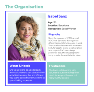
Personas


Jobs to be Done
From User Stories to HMW (How Might We) to JTBD (Jobs to be done)
- Show short term volunteers in a clear and appealing way with clear info.
- Be able to join projects without having to contact the organisation or the volunteers (saving time to everyone)
- Have a very good filter and sort section to help finding what volunteers want and get some inspiration.
- See what activities are near by and during the following days.
- Create a very good volunteer profile where organisations can see if they are trustful people and they are likely to show up in the events they applied.
- Create a very good organisations profile where volunteers can see if it’s a legit and trustful organisation.
3. Ideation:
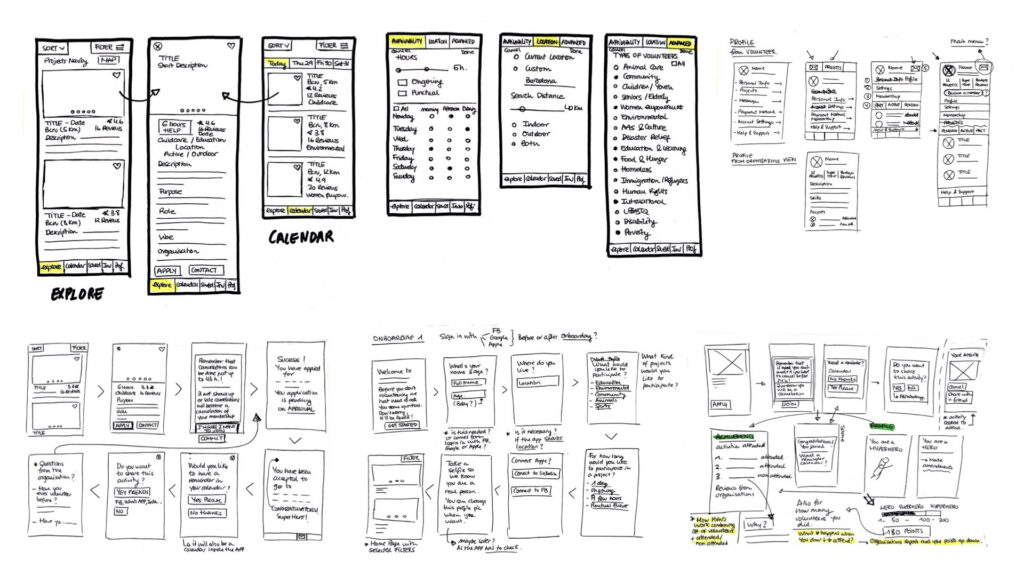
Sketching

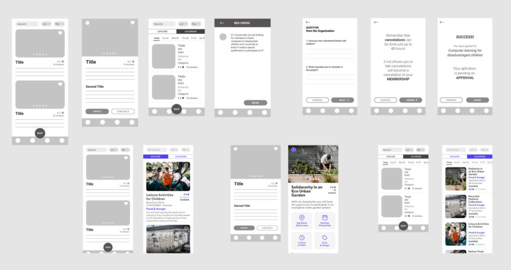
Wireframes

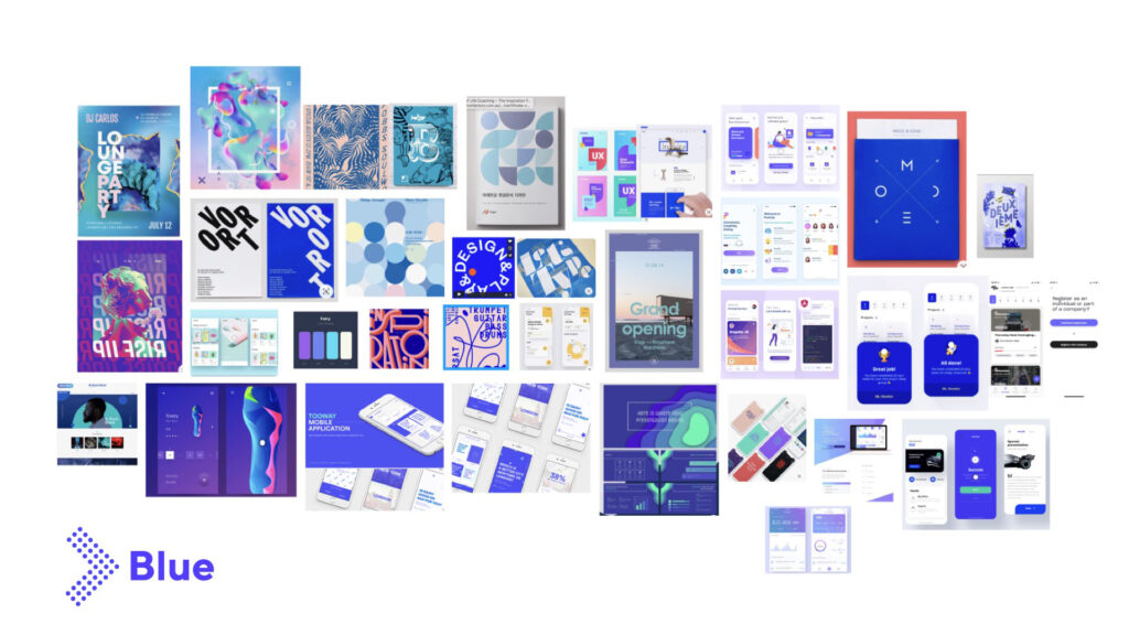
Mood Board
Playful, neutral, fresh
Blue is associated with freedom, intuition, imagination, inspiration and sensitivity. Blue also represents meanings of trust, loyalty, sincerity, wisdom, confidence, stability and intelligence. The colour blue has positive affects on the mind and the body.
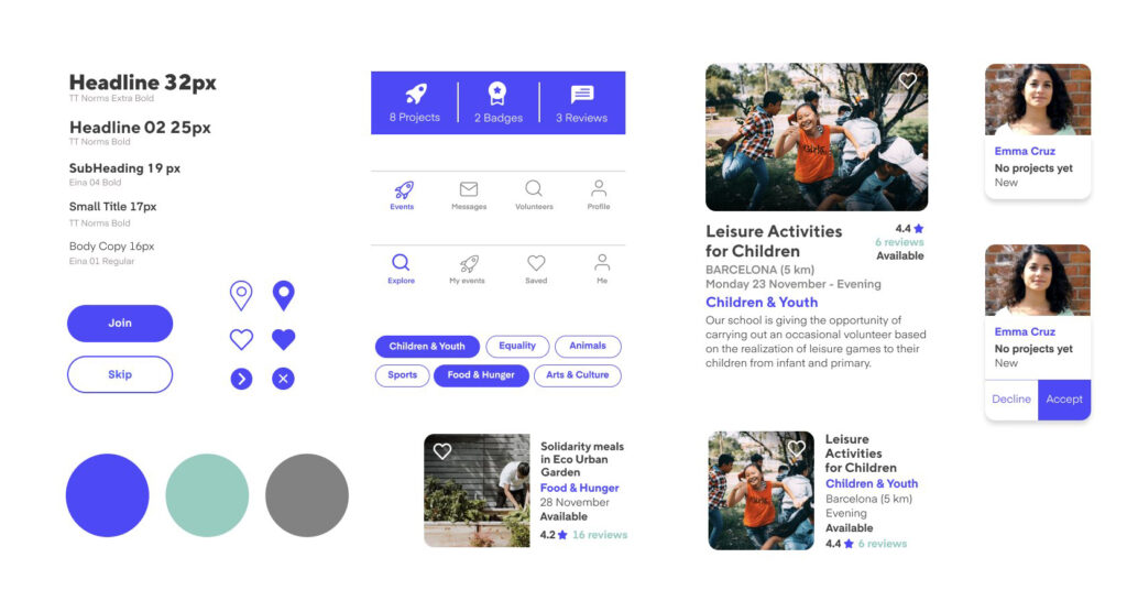
Design System

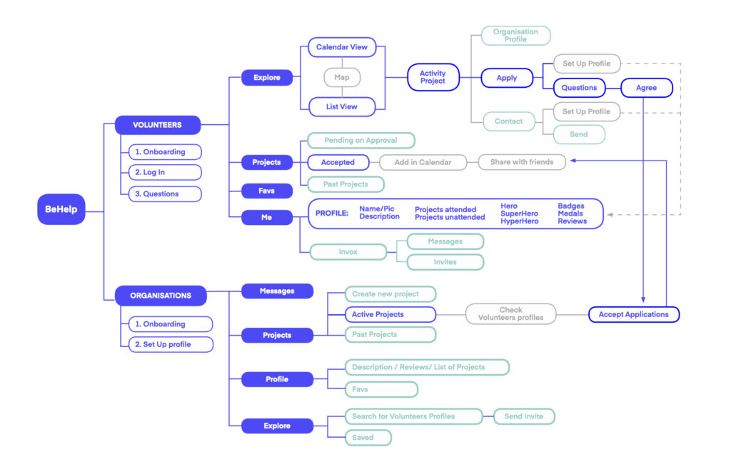
Sitemap
There are two roots, one for Volunteers and one for Organisations with different features depending on their needs.

Task Flow
- Volunteers looking and finding the project they want to participate.
- Organisations checking volunteers profiles and accepting or declining them.
- Volunteers receiving a notification letting them know if they have been accepted or not.

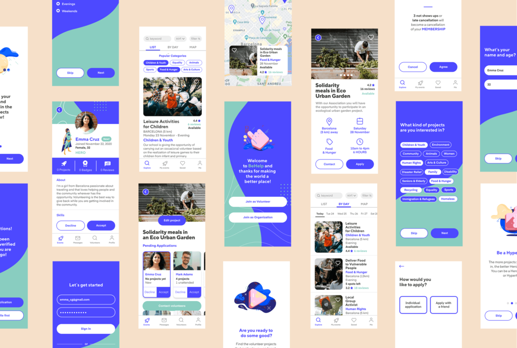
UI Design

4. Prototype
5. Test:
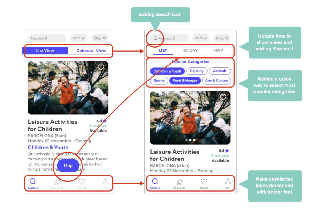
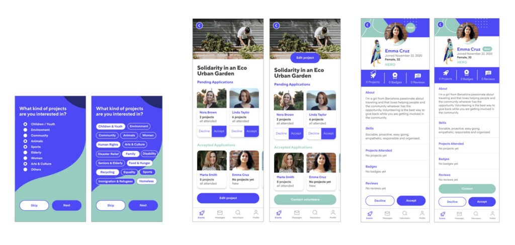
I did 7 Usability Tests with different users and made the following iterations:


KPI:
We will measure the success of the app with the following actions:
Quantitative:
- Measuring how many potential volunteers and organisations have joined the App.
- Measuring how many events have been created by country and topic
- Measuring how many people have applied to go to events
- Measuring how many applications have been accepted and how many declined
- Measuring if events have reached the number of volunteers they were asking through the app
- Measuring how popular is in social media, specially in Facebook
Qualitative:
- Interview organisations that have joined to measure if it helped them to find more volunteers in an easy way without having to waste so much time.
- Interview people who volunteer to measure if they could find the project they liked in an easy way.
Next Steps:
Immediate Steps
- Filter and Sort Section
- Favourites section
- Detailed Reviews
- Volunteer second user journey
- Adding option for people who didn’t show up to explain themselves
Long Term Steps
- Monetisation and creating a Membership
- Add longer-term events
- Add activities from personal people not just from organisations
My takeaways:
What I have learnt
- Qualitative Research is very important
- Keep Testing – Keep iterating
- Keep your User Persona always in mind
- User-centric approach made me see design in general in a very different way and understanding how effective is to be able to solve problems.

