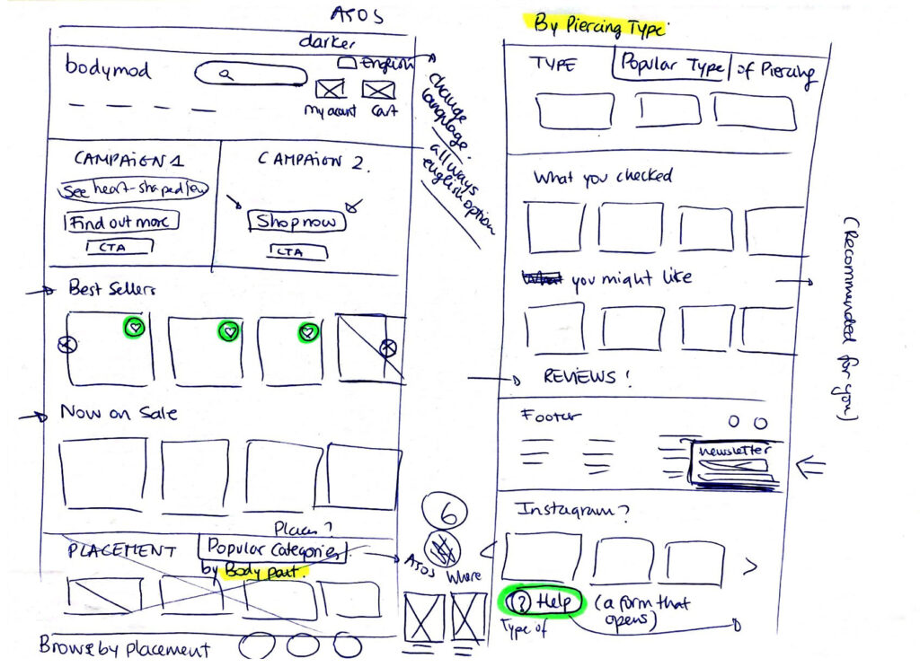
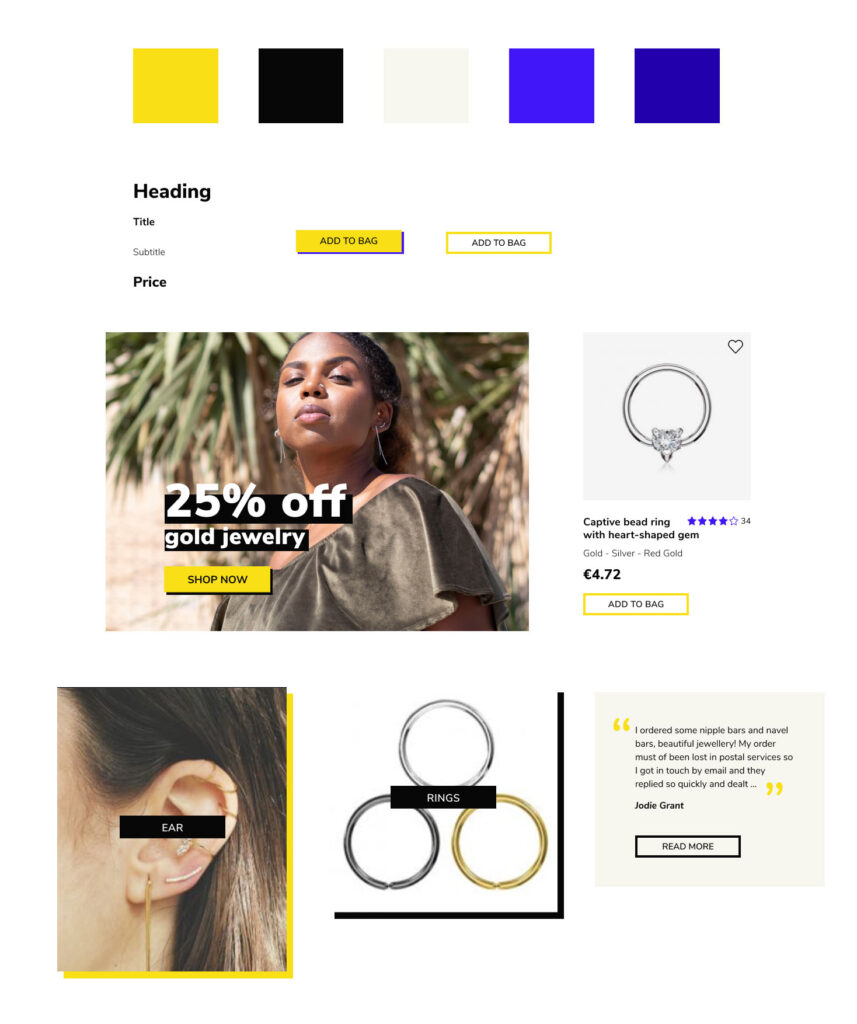
The client wanted to redesign the front page to start with. They wanted to use the homepage as a shop window and to inspire their visitors and encourage them to step into the shop and start exploring (clicking a path deeper). Therefore they wanted a design that was inspiring and accommodated their many categories and campaigns.
Background
The front page should be showing an overview of their many different options and great marketing offers in a neat and presentable way. They wanted to guide their visitors to the webshop sections that are relevant for them. ‘Less is more’.
They run multiple campaigns all year, and often they have campaigns that overlap. Furthermore, they have multiple categories divided into two main sections: ‘Shop by placement’ and ‘Shop by type’. Hence they have a lot of different categories to offer. Still, compared to other webshops, some categories are totally irrelevant if the customer does not have such a piercing.


